


How a simple floral cut-out became a spectacular quilt
Plus, the many mood boards that got me there.

Hi friends,
This week, I’m sharing things that have given me inspiration and fortitude, from my local indie bookshop to a statement t-shirt to a retrospective on artist Ruth Asawa at SFMOMA. The museum posted about the show with a quote from Asawa’s teacher and lifelong mentor, Josef Albers: “Open your eyes and see. My aim is to make you see more than you want to. I am here to destroy all your prejudices. If you don’t already have a style don’t bring it with you. It will only be in the way.”
At their core, art and design are about looking closely and entering another person’s point of view, even if unfamiliar, as well as finding your own vision. Design at its best supports the user no matter who they are. (I wrote about empathy in design in an earlier post.)
When our country is in such precarious times—when we have people in leadership who are focused on power and money and systematically dismantling our rights and protections—it can feel trivial to spend energy focusing on beautiful objects. In the face of such strife, are my thoughts on design important? But I have to remember that our self-expression and our creativity is also at risk. These things still matter because they bring us joy and comfort. So I carry on and hope that my musings can be a reminder of what our creative voices can bring to the world. This weekend’s protest and the variety of signs—some witty, some raunchy, some beautiful and full of hope—is just one example. What a moment of unity to take part in.
Wishing you all a wonderful week… Here we go!
Shelf Improvement
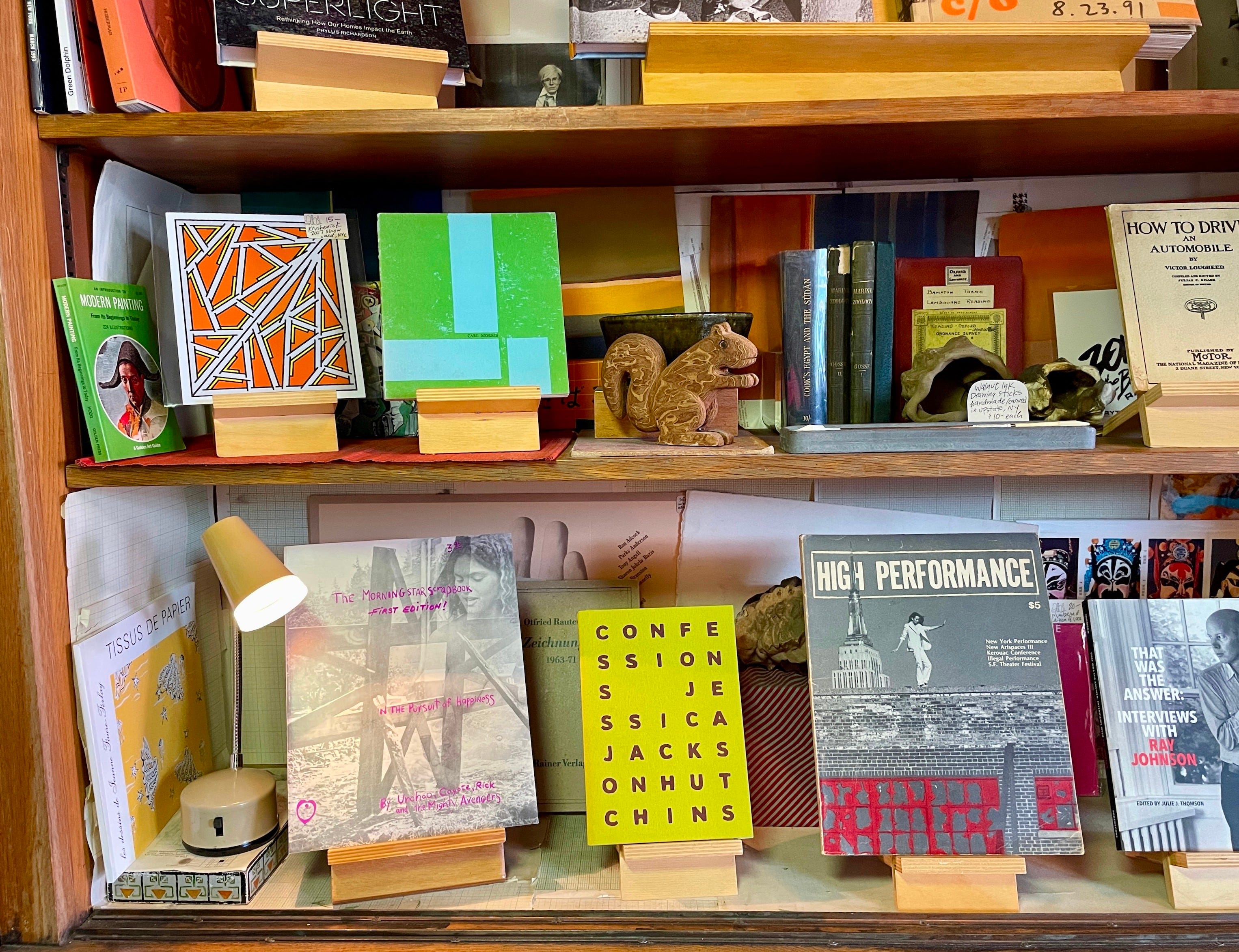
We have an amazing vintage bookshop in my neighborhood called Monograph Bookwerks that I stop at on my regular weekend strolls. It’s been going for 15 years and is owned by two lovely artists, John and Blair, who stock books on design and art. I could sit in there for hours hopping between sections on architecture, textiles, furniture, and more. Sometimes a pattern on the cover is just as inspiring as all the ideas documented inside.
Plum Picks

As I noted in the spring, I’m seeing purple come back in a big way. From lilac to aubergine, mauve is having a moment! Recently, two homes caught my eye for their confident use of pattern that really lean into purple. In particular, the statement sofas in this beachy Aussie bungalow (designed by Joanna Barlow of Maccormick Architects for her sister’s home; I love the idea that family can potentially push us to take bigger risks—design or otherwise); and this residential project in Pennsylvania by Brooklyn-based JAM studio, who reimagined a vintage sofa in a cool custom print. Grey seating couldn’t deliver the same amount of fun!
Dream Weaver
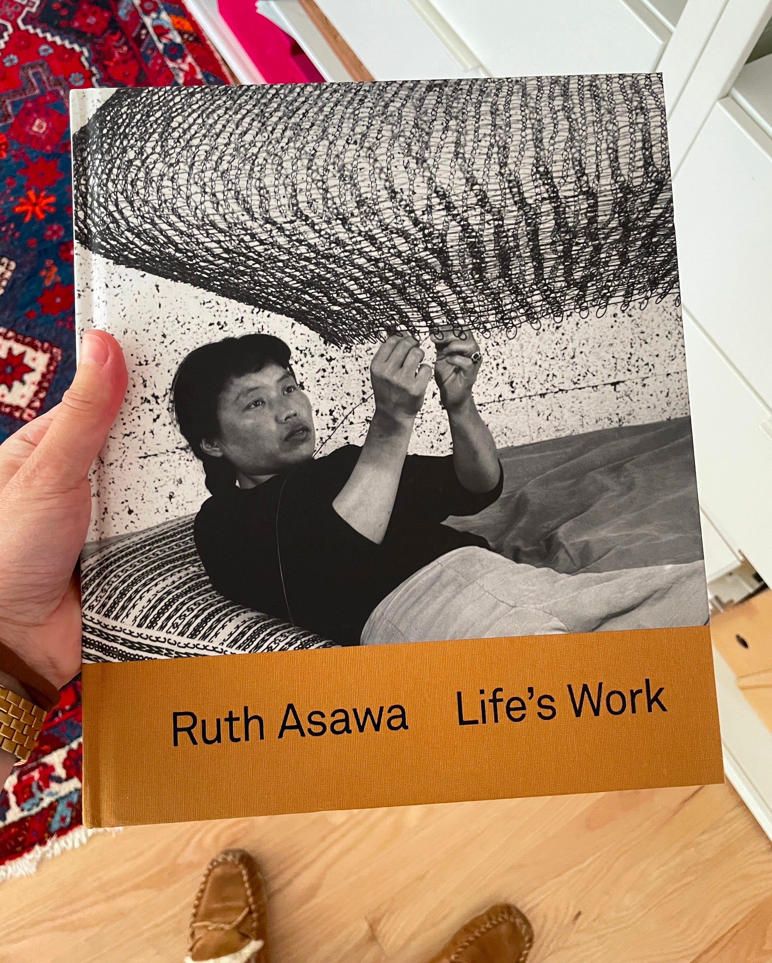
I cannot miss the Ruth Asawa retrospective at SFMOMA (which closes after Labor Day weekend, so we all still have time). Anyone been? My love of Asawa’s work comes from my mother, who is an avid art lover and collector. She has a piece that looks like it could be an Asawa sculpture; she hasn't authenticated it yet but is pretty sure it’s the real deal (!) I love how Asawa transformed metal wire into seemingly living organic objects. She infused such fluidity and poetry into her woven forms. The repetitive looping technique creates a rhythmic visual meditation that allows me to imagine Asawa’s mindset in the process of making. A must-see for anyone in San Francisco this summer!
Petal Power
During summers in my college years, I worked for a florist in Santa Cruz. My friend and I submitted a proposal to Oprah when she was doing a women in business competition to start a floral company. It was going to be called Wallflower. I still dream about making that a reality one day…
Fast-forward to working at Schoolhouse: The brand’s heritage is rooted in utility—and this comes through in our lighting, furniture, and hardware. The clean lines, functionality, and straightforward designs inspired by industrial spaces and workshops have been a core part of our product assortment for many years. So when we started introducing more textiles, we focused on classic geometries, like stripes, checks, and plaids (I can't resist a good plaid) that aligned with this utilitarian mindset.
In recent years, we’ve also brought more florals into the mix, but it’s been important to create something that still feels Schoolhouse. We’ve approached botanical designs in a few different ways, and I’m going to share a behind-the-scenes for three pieces below.
I love researching how different designers have interpreted florals through the years. Some of my favorites, if you want to take a deeper dive: Marimekko, Josef Frank, Hella Jongerius, Althea McNish, Sonia Delaunay, Marguerita Mergentime, Dusen Dusen… Let me know your mood board mainstays in the comments below!
Stillwater

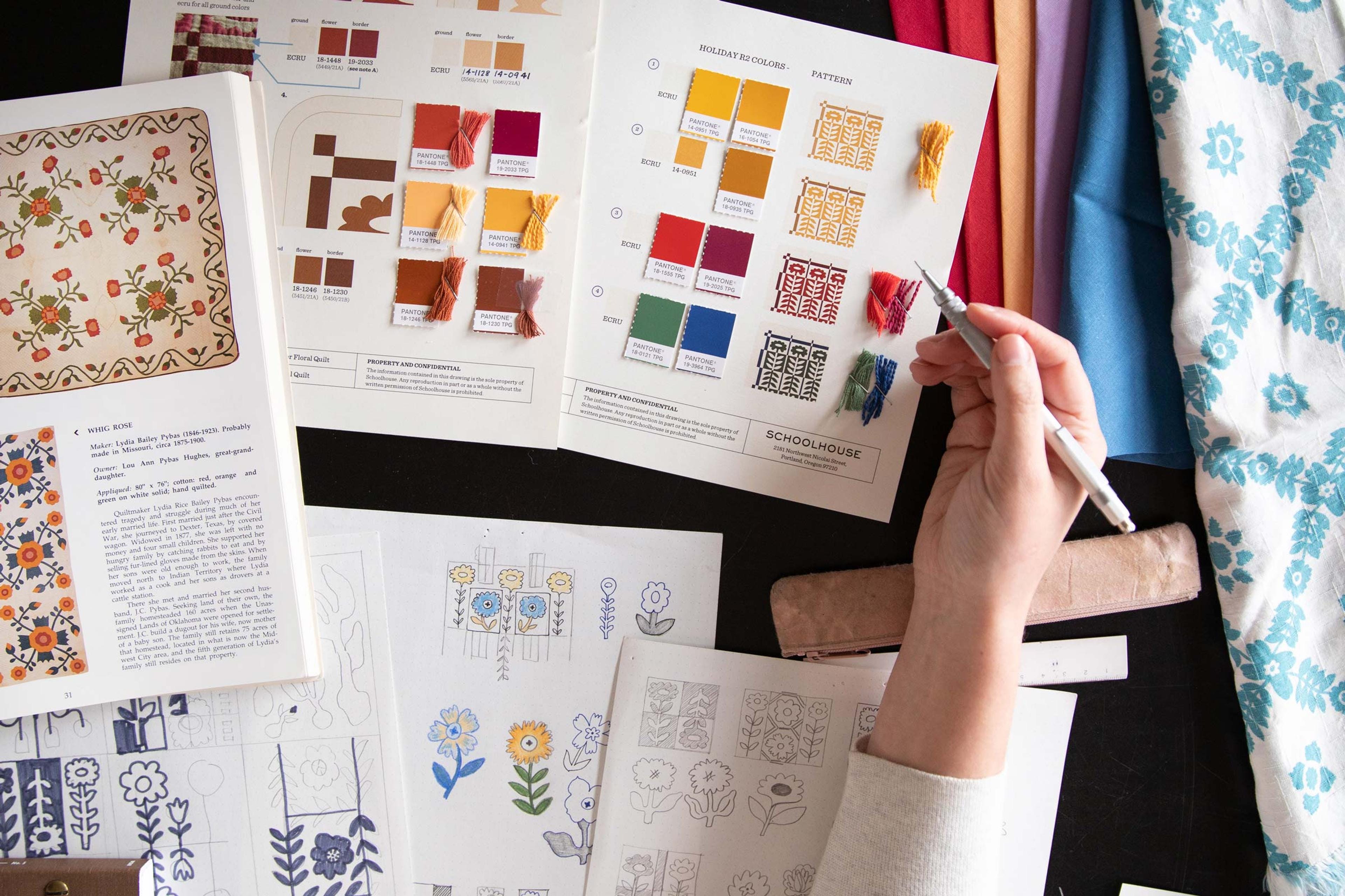
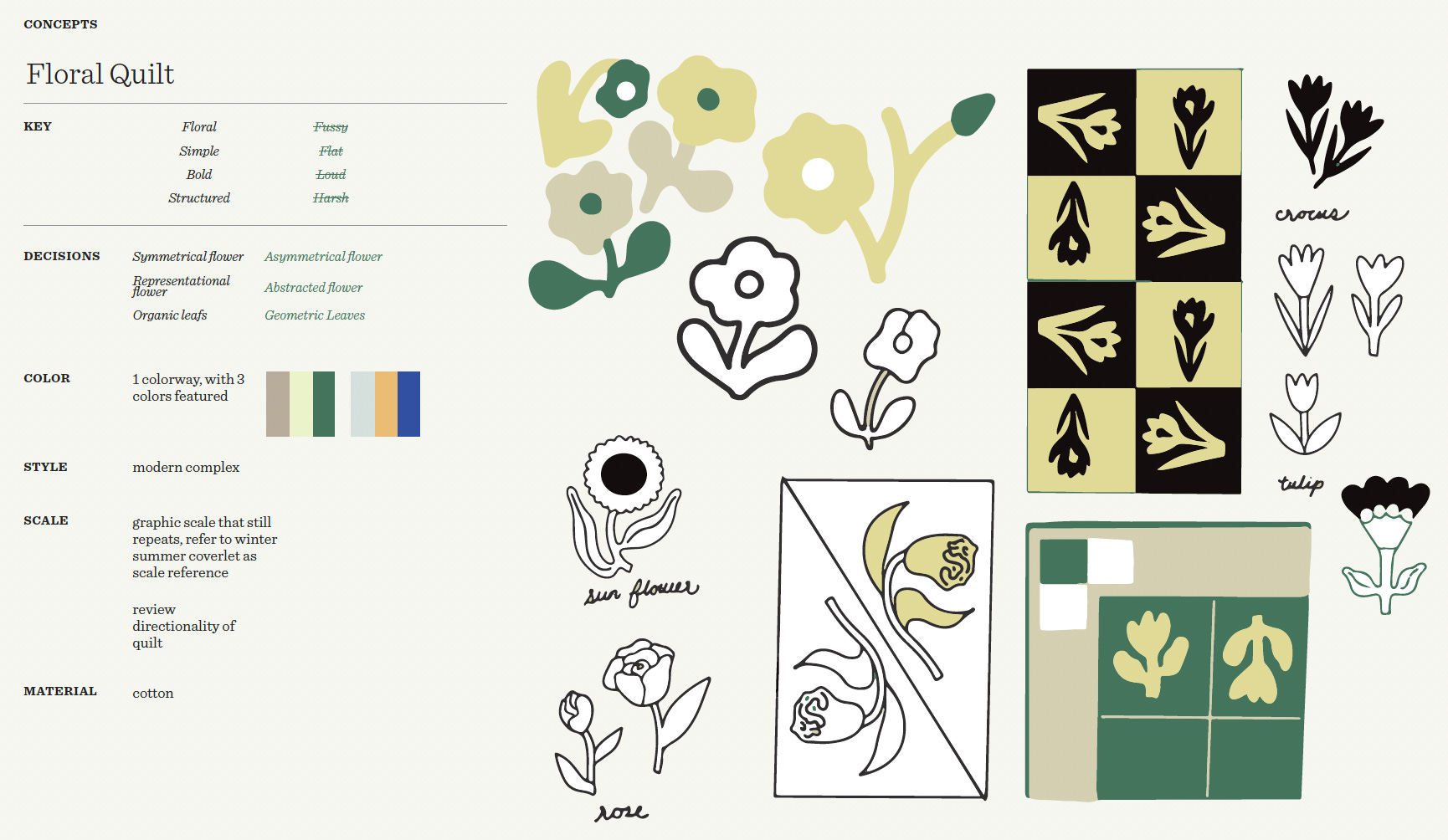
Perhaps our best known product, Stillwater, launched in 2022 and was originally briefed quite simply as a “floral grid” quilt. Quilts provide the groundwork for storytelling and structure inherent to the technique, so it was fun to play around with lots of pattern possibilities.
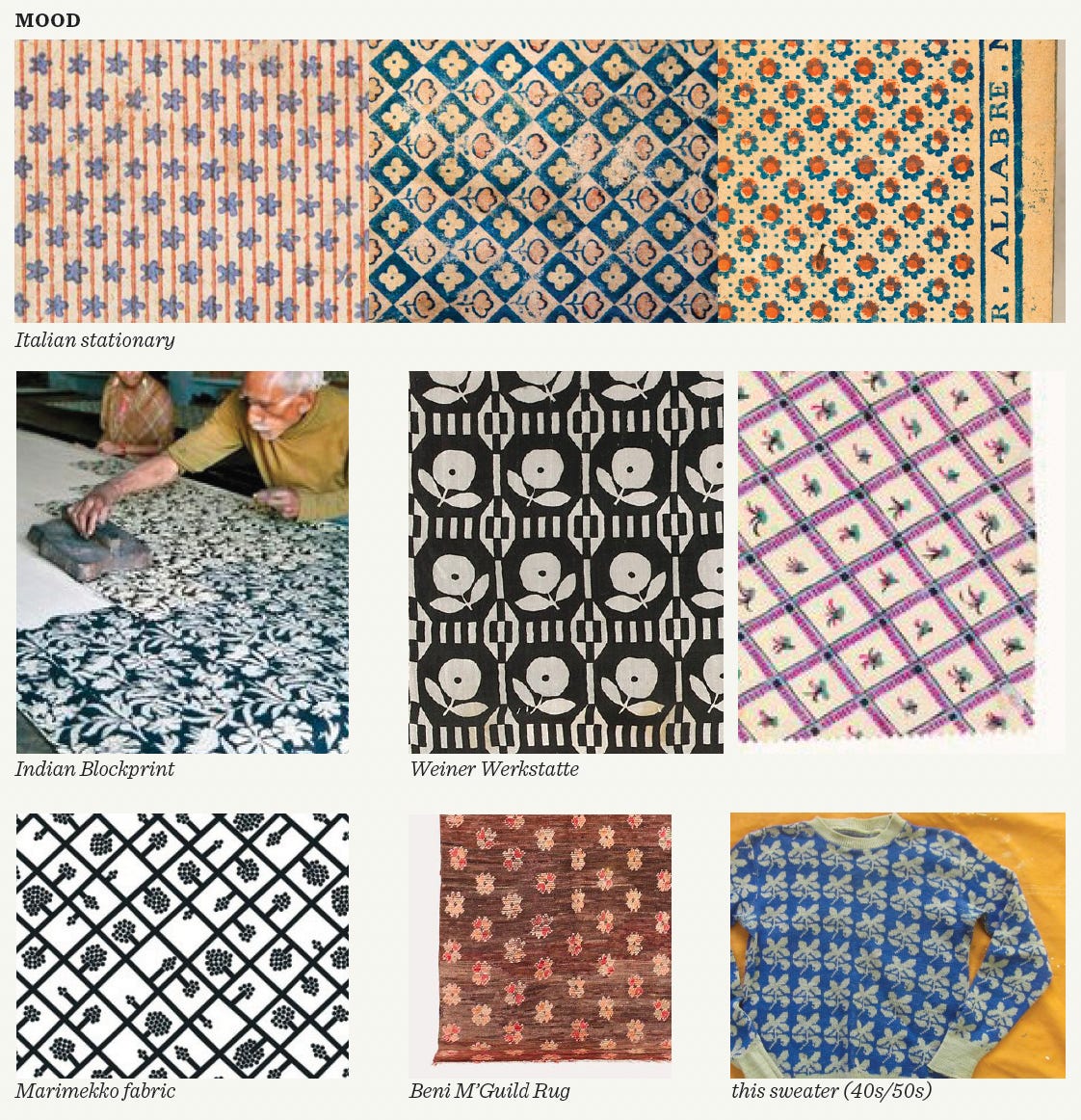
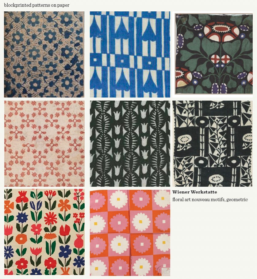
From there, we pulled from various references, including a book on homemade 19th-century American quilts (snap it up while you can!); Italian stationary; prints from the Wiener Werkstätte; Indian block prints; and the work of Alexander Girard, whose simple folk forms with soft, symmetrical edges led us to an approachable and familiar-feeling motif. Stillwater’s overlaying grid and checkerboard color lean both classic and modern.
Blooming Field
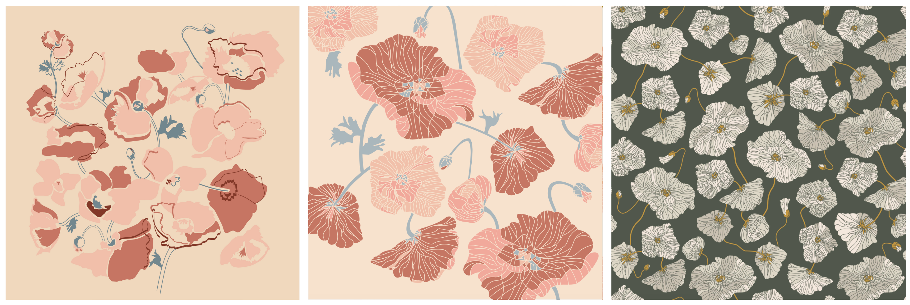
The Blooming Field pattern has a lot of organic movement, balanced by strong line work that creates a faceted-like texture. The poppy motif was top-of-mind for our designer at the time, as she was planning her own wedding and growing poppies to decorate the festivities. She played with variations on the flower cycle, from closed buds to open blooms.
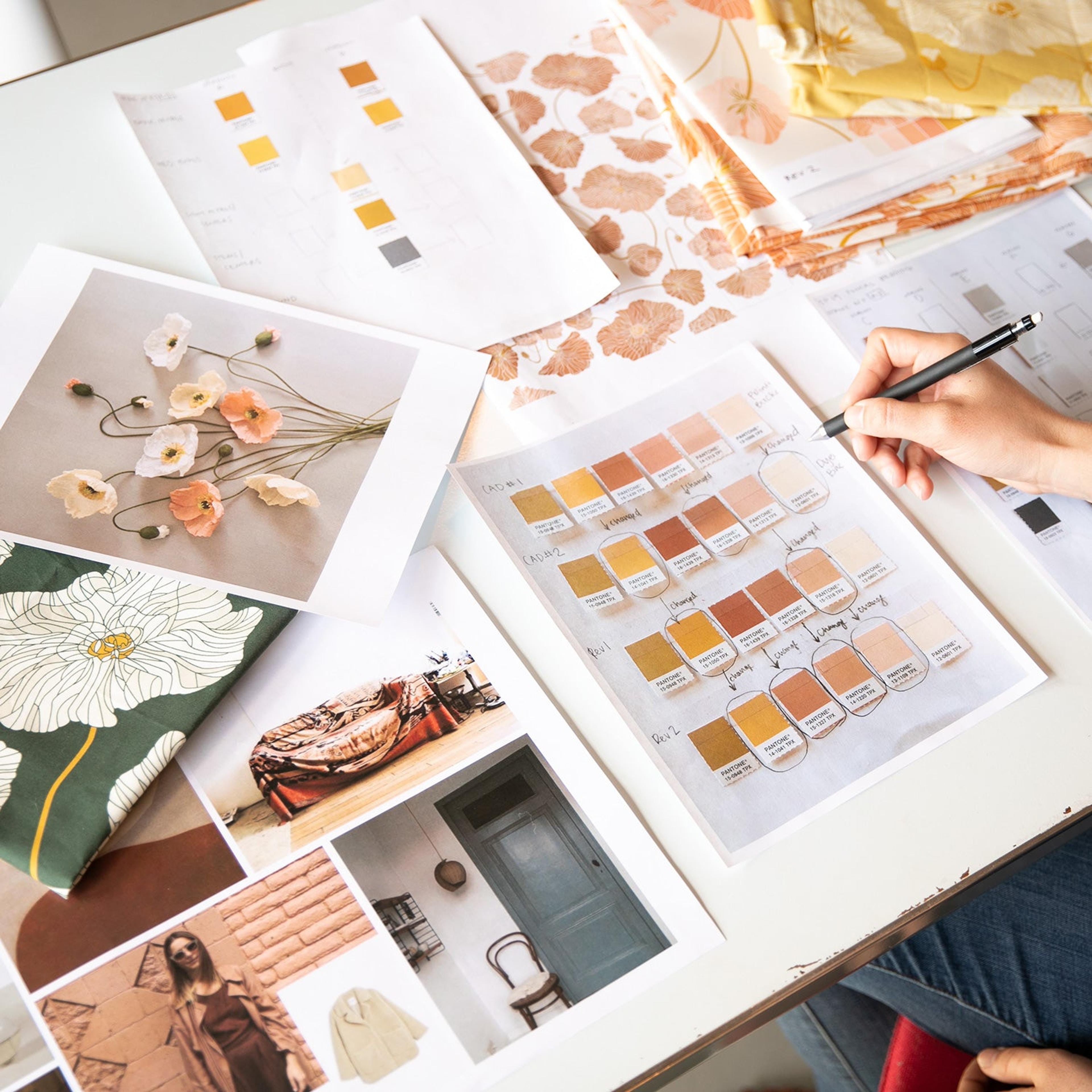
I like how the precise illustration style gives some edge to a very flowy pattern. We ultimately evolved away from a peaches-and-cream palette to a more high-contrast gold and green—which was critical in avoiding a predictably soft, sweet floral.
Wallowa

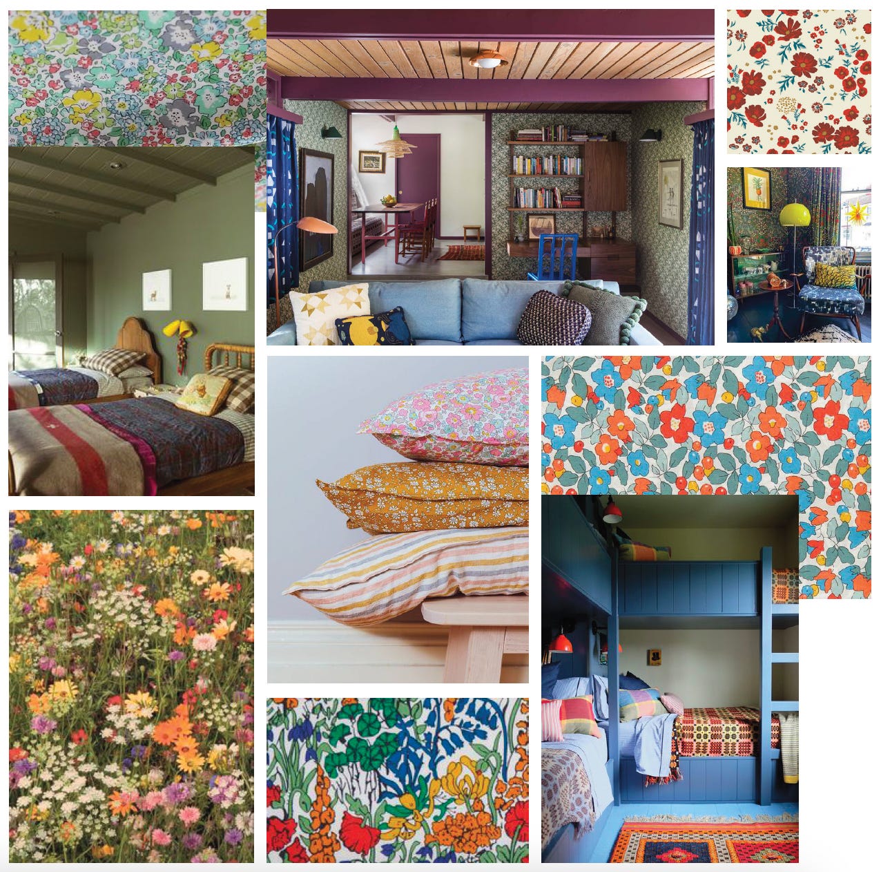
You can’t talk about floral design without a nod to Liberty of London. The brand’s iconic florals and paisleys—which were first produced in the late 19th-century and heavily influenced by Indian and Japanese styles, as well as William Morris—channel an English sensibility and have become instantly recognizable.
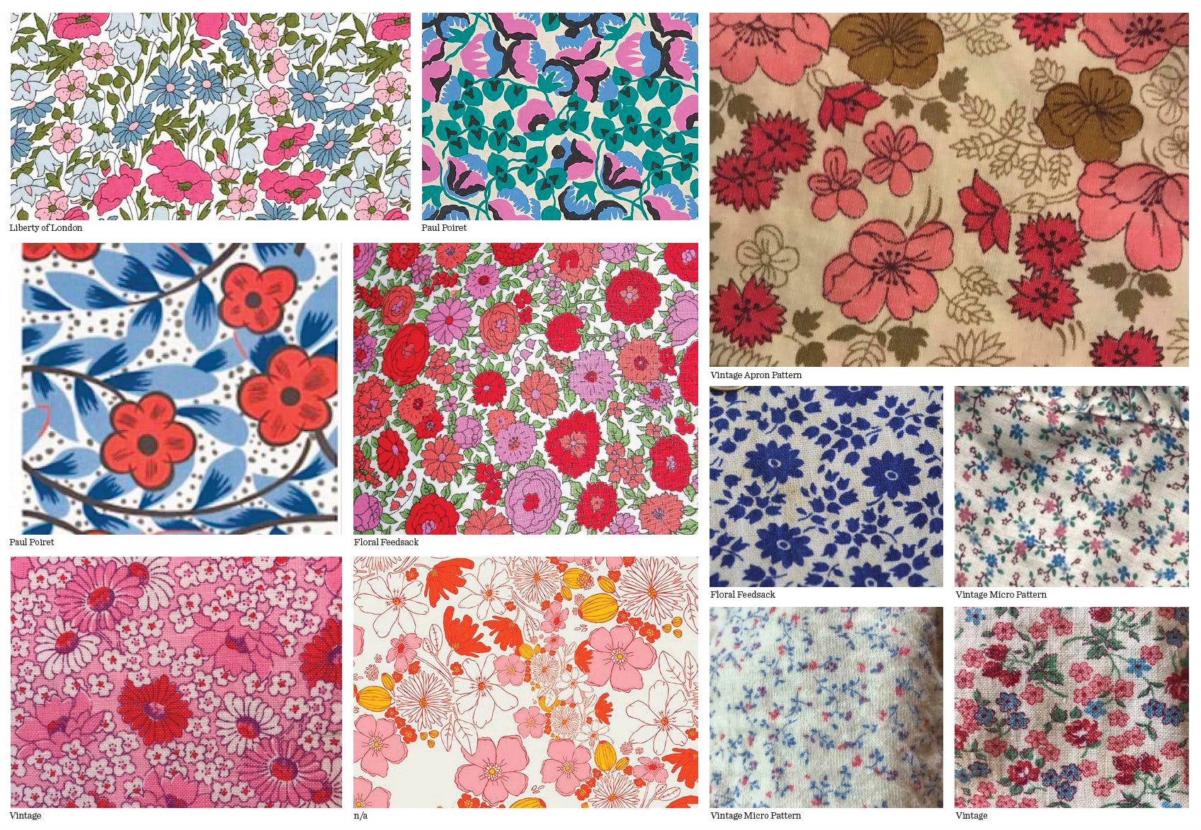
For our Wallowa sheeting collection, we were inspired by those dense, delicate Liberty florals, but wanted to create something uniquely Schoolhouse. So we looked to nature outside our own doors in the Pacific Northwest. Wallowa is named after the mountains in eastern Oregon that are known for their spectacular native wildflowers. The design’s crisp outlines, flat-fill of color, and simple line work capture a graphic quality. It’s almost like taking a nap in a meadow surrounded by blooms.


To a Tee
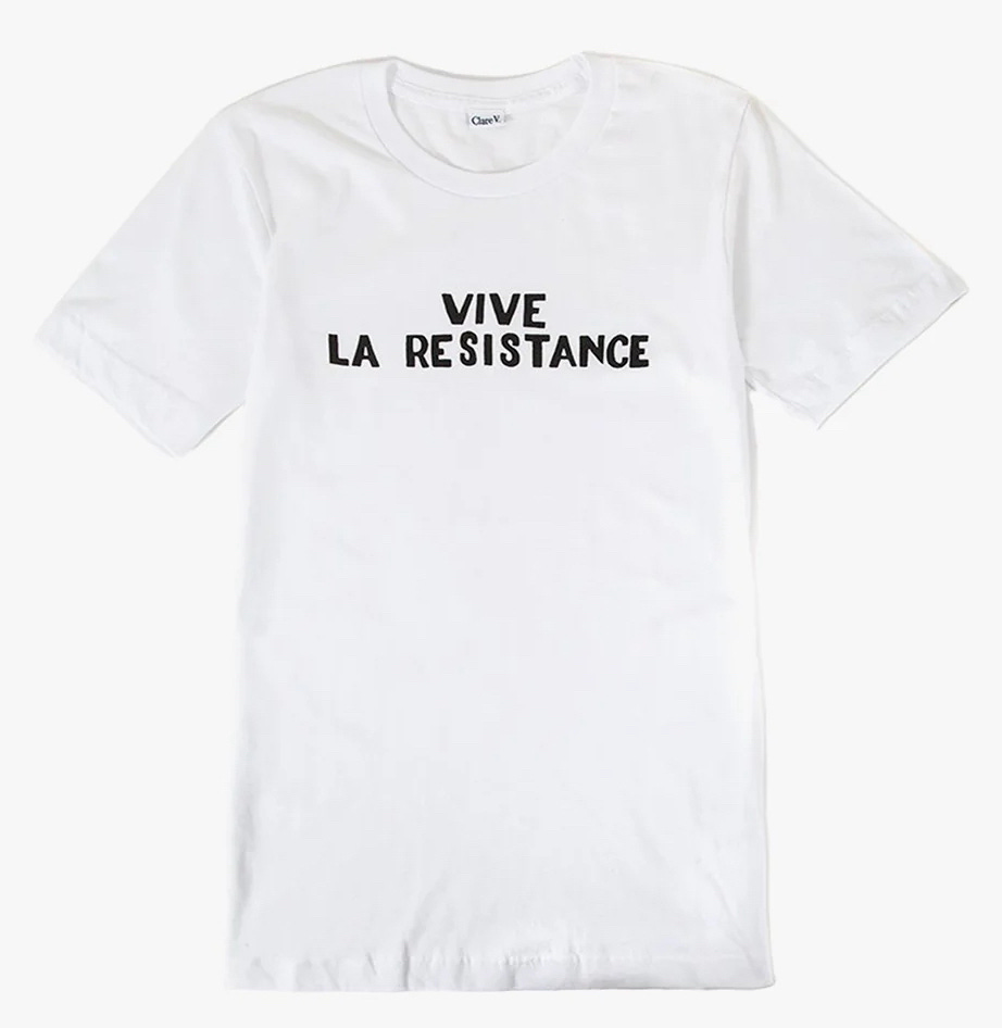
I wish I had this simple white t-shirt to wear at last weekend’s protest. Thanks Clare V. for standing up for what you believe in.
Which floral designs (vintage or new) brighten up your world?
Katie xx
I love the Stillwater quilt! I'd been lusting over the white one but now it's gone. Do you think it will come back?
Love your newsletter, thank you for the inspiration! And don't miss the Ruth Asawa. The breadth or her work is stunning and the exhibition is really moving. I'm going for a second time this weekend :)