

My easy color tricks for creating a vibrant home
Including how to curate a palette like a pro.

Hi there!
This week, we’re dipping into the world of color. When I was five, my parents refreshed our bedrooms, and my adored, melted crayon-dotted, synthetic, bright blue rug was swapped with a lovely natural wool one. I get it now, but I was so devastated and shocked that anyone would think that changing blue for beige would be an improvement. Fast-forward to grad school: My roommate/bestie painted our bathroom with Benjamin Moore Hot Lips (calling Elle Woods) and I discovered the unapologetic hue could make any visit to the bathroom a party. My visceral connections to color keep coming, as I’m sure yours do, too.
Playing with color is super creative and intuitive, but there are some tricks and tools that can help a room, gallery wall, outfit, etc. really click into place. Think: impactful yet intentional. I gathered a few ways I experience color below—through nature, materials, and architecture and design (of course!)—plus, my color combo cheat sheet and a peek behind the scenes at the Schoolhouse team’s process for putting together an A+ palette.
Here we go!

Into the Elements

Two weeks ago, my wife, 9-year-old son, and I set out on a National Park spring break adventure across Utah and Arizona, with stops in Zion, Bryce, Arches/Moab, Monument Valley, Antelope Canyon, and Grand Canyon. (Obama created a wonderful program in 2015 where all 4th graders get a free year pass to the National Parks, a great excuse to see these bucket list places!) We drove 1,200 miles and took 109,677 steps over the course of 10 days.
The dry, rocky landscape of Utah and Arizona is such a contrast from the PNW. In Portland, we’re surrounded by evergreens and drizzly skies at this time of year, so it was a real shift to be among the monumental red rock outcrops that filled my view with a warm, earthy glow. Every form—an arch, a tree, a rock face wall—looks like sculpture. Those tones of brown, red, ochre, and orange set across a vast, often barren desert radiate rich, dazzling color that you can almost feel imbuing your skin.
Rainbow-Tinted Glass


We often think of stained glass as reserved for historic buildings—grand churches, cozy craftsman homes—but I’m loving contemporary uses, like here and here. At the Future Perfect in L.A., rose-hued glass pendant lights hanging in the garden were a perfect example. Designed by Art Luna Studio with a nod to the traditional art of bullseye glass, the three-paned pieces appear as a sort of porthole or eye, catching the light (or, when illuminated at night, casting it). So intriguing!
For vintage inspo, Frank Lloyd Wright’s Hollyhock House in L.A. is a colored glass masterclass. His iconic geometric patterning can be spotted throughout the property’s woodwork, stonework, and custom carpeting—all abstract interpretations of the hollyhock flower. But for me, it’s the delicate colored glass that really shines. Little purple triangles on both the exterior and interior windows create ethereal projections in the rooms, moving throughout the space during the day like an epic kaleidoscope.
Living In Color


As an architect, Luis Barragán’s bold color, textured materiality, and simplicity in form create a poetry of space that has always enthralled me. Barragán was influenced by Le Corbusier and the Minimalist movement, but he quickly rejected the notion that architecture is a “machine for living” in favor of “emotional architecture”—human-centric places where people gain a sense of well-being. He masterfully used vernacular materials from his native Mexico—stucco, rough concrete, natural wood—punctuated by vast expanses of vibrant color to add dimension and surprise.
At Casa Gilardi (right), which he completed in the 1970s, the walls, ceiling, and glass panes were all painted yellow to create a glowing, transcendent walkway. In his home in Mexico City, Casa Luis Barragán (left), I love the warm embrace of the vivid pink and red walls, grounded by the volcanic stone flooring. The gold leaf art at the top of the stairs acts as a shimmering welcome as you enter a new space. Don’t you want to step right inside?

Color In Context
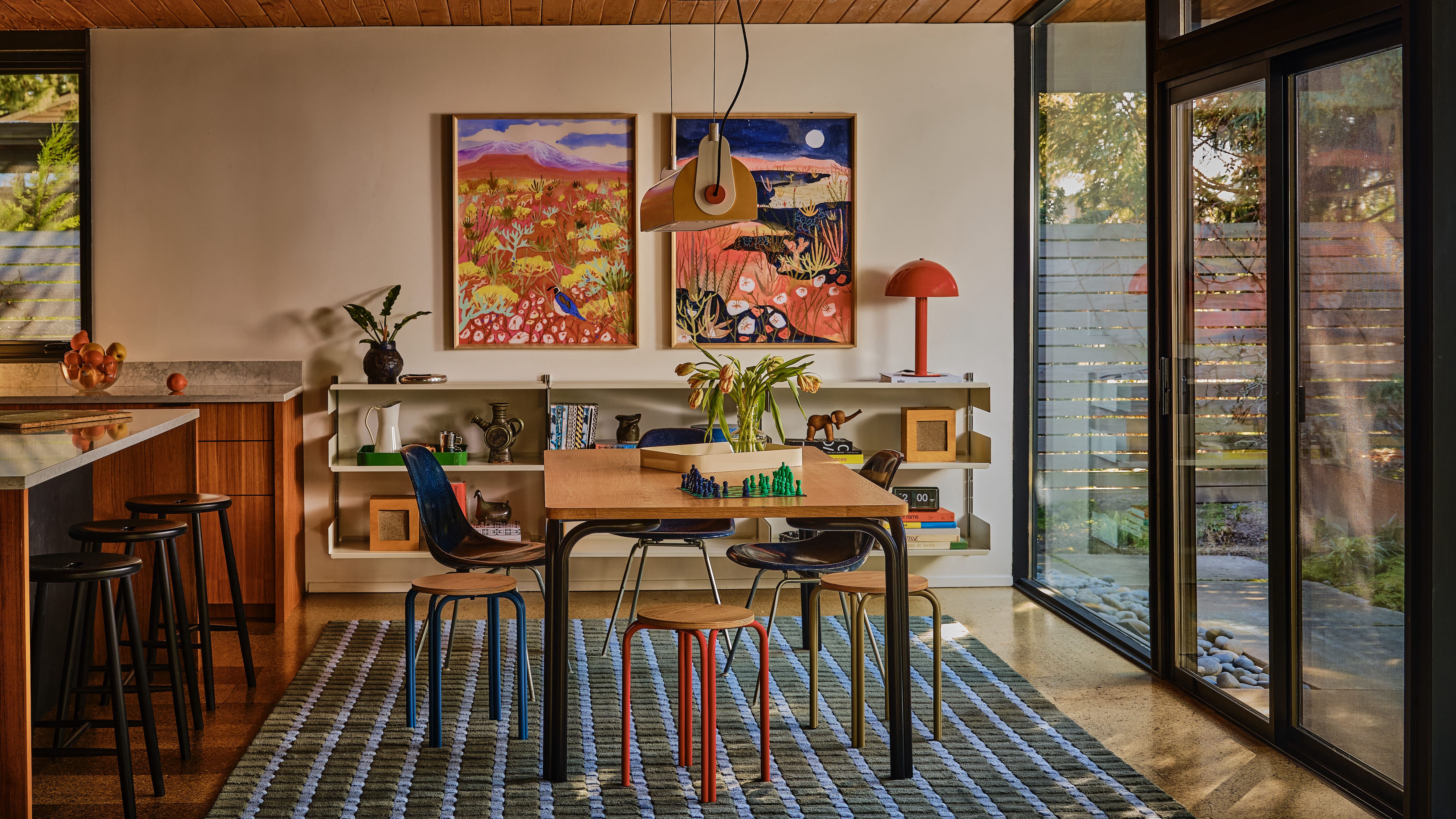
I talk about color everyday at work. It is so central to our design ethos at Schoolhouse. Color is like magic design dust: We can take a simple pattern and make it more dynamic, or pull up a traditional design and make it feel fresh and modern. But, as with most things that look effortless, color is also one of the trickiest things to get right. It’s very subjective; we all have different associations and preferences.


The Schoolhouse team is currently working on our Fall 2026 palette. In the early stages that means gathering a bunch of objects and swatches in shades we are considering and laying them all out on a long table to then experiment with combinations. This takes a lot of trial and error. You can’t look at a color in a vacuum but rather in the context of how it will be used and what with: Textile or wood or metal? Utility object or furniture or decor? Accent hue or main character color? The list goes on…


While we like to play with a lot of punchy shades at Schoolhouse, I work to find a balance with neutrals, which actually has the effect of making the color pop even more (cue: cherry red and sage green; cobalt blue and deep brown; crisp white and rusty orange). We also sometimes shift a bright tone to be more muted or darker as a way to ground and neutralize it. (This is a good option if you want more color in your life, but don’t gravitate toward vibrant rainbow hues.) Another trick: Use a dash of unexpected color in an unexpected place to add interest—a switch on a lamp, or a stitch detail in a duvet cover—for a delightful discovery vs. a big statement moment.
I think about this when I’m getting dressed, too. It’s like adding red lipstick or red shoes to an otherwise neutral outfit. I love the idea of people leaning into a signature color over the years, a hue that resonates and feels good to you, whether in a home or an outfit—while also convincing a person that a color that doesn’t normally speak to them all of a sudden makes sense by seeing it in a new context. To wrap up, here are just a few of my favorite sources for color inspo: home/lifestyle brands Marimekko and Dusen Dusen; fashion designer Rachel Comey; painter Richard Diebenkorn; interior designer Reath Interiors…

Chromatic Cheat Sheet
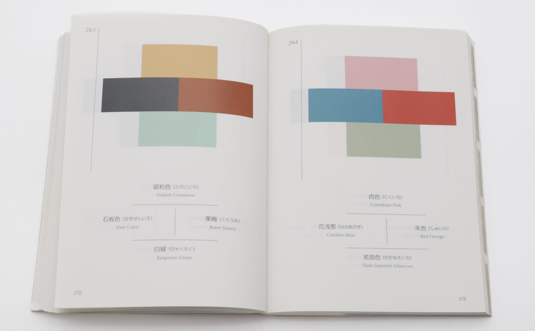
Relatively slim but mighty, the 1930s Japanese classic A Dictionary of Color Combinations by Sanzo Wada has a permanent place on top of my desk. Both volumes are a must-read!
What are your color inspirations and tips?
Katie xx
I LOVE Luis Barragán's work, thank you for sharing--never seen him before! And many of the others you posted are perennial favorites of mine like Marimekko and Dusen Dusen :)
My one regret in furniture has been a Grey couch. I keep eyeing a hot pink couch that I know I should have bought instead...Elle woods would approve;)